Use the hierarchical circle packing chart to group hierarchical data into a series of hierarchical circles. This is a good way to group large amounts of data in a hierarchical manner; depending on the user's requirements, this may be multiple levels of a single user hierarchy, or it may be different flat hierarchies.
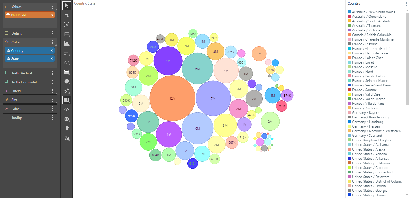
As with the circle packing chart, the size of each circle is driven by its value, while the color is driven by the corresponding member element(s). However, while the circle packing chart arranges all the data into circles of varying sizes and places them within one circular formation, the hierarchical circle packing chart organizes the data into subgroups; within the main circular formation are multiple sub-circular formations, within which the data circles are placed. For instance, in the image below, the data is organized into sub-circles representing countries; within each of these formation each colored data circle represents a state in that country.
Build a Hierarchical Circle Packing Chart
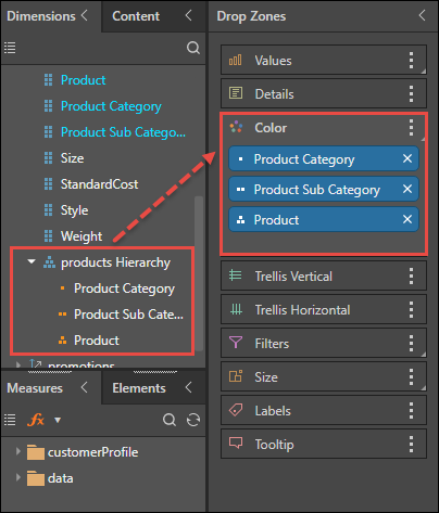
To build a hierarchical circle packing chart, place the required blue chips in the Color zone, in the desired hierarchical order, and add a measure to the values zone. The blue chips may be taken from a single user hierarchy (as in the image below), or they may be separate flat hierarchies, and they may or may not be from different dimensions.
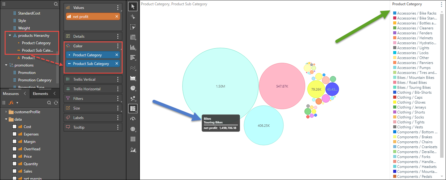
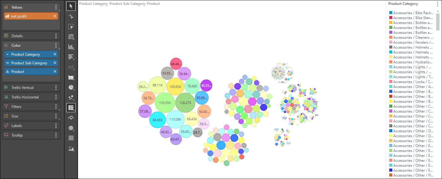
In the image below, each colored circle represents a product subcategory; these subcategories are grouped by the parent hierarchy Product Category. This is reflected in the legend (green arrow below). The tooltip displays the member elements and value for each data point (blue arrow).
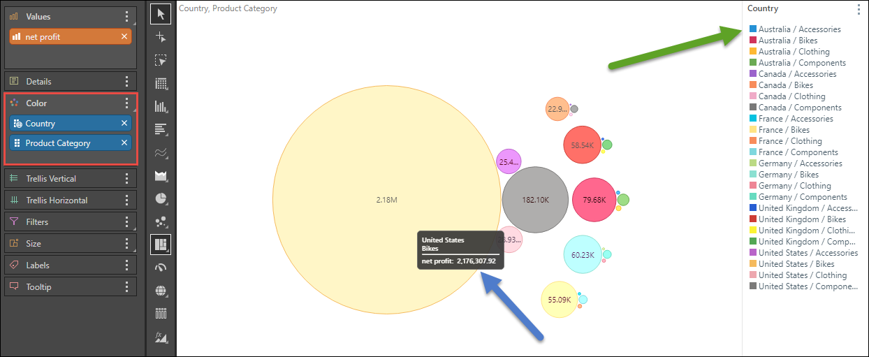
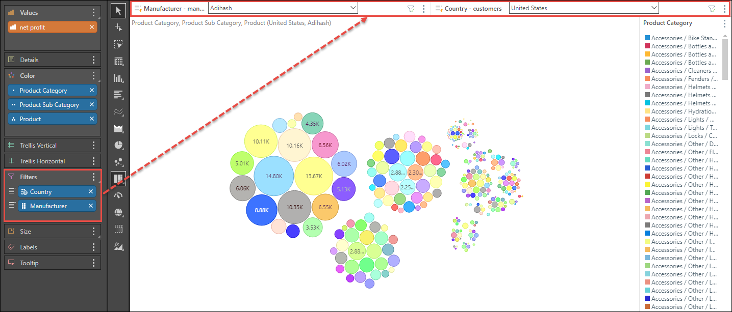
In the following image, the given blue chips come not only from separate flat hierarchies, but also from different dimensions. Each colored circle represents a member element from the Product Category hierarchy. The product category members are grouped by the first given blue chip (Country), as is reflected in the legend (green arrow below). The tooltip displays the country, product category, and net profit for each data point (blue arrow).
Examples
Example 1
Use the Sample Demo model to follow this example.
Step 1
Open the Products hierarchy from the Products dimension; add the first level, Product Category, to the Color drop zone.
Step 2
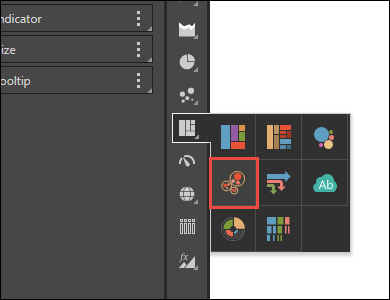
Select Hierarchical Circle Packing chart from the visualization menu.
Step 3
From the Products hierarchy, add Product Subcategory and Product to the Color zone.
Step 4
Add the Net Profit measure to Values.
Example 2
Following on from Example 1 (above) follow the steps below to further define the query.
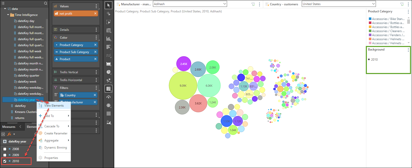
Step 1
Add Country and Manufacturer to the Filters zone; from the resulting slicers, filter the query by country and manufacturer.
Step 2
From the Data dimension, go to the dateKey year hierarchy and open its Elements tree (red highlight); select 2010 to add a background filter (green highlight) to the query and filter it to show results for 2010 only.